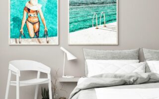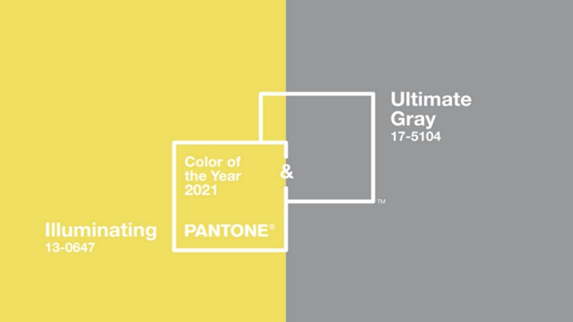
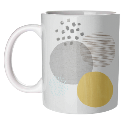
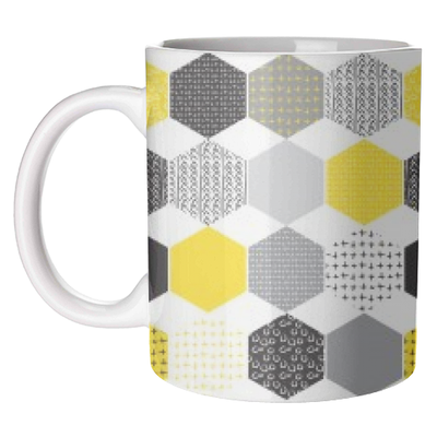
Using the marriage of two colours to convey a message of strength and hopefulness, Pantone’s Colour of the Year 2021 is the combination of Ultimate Grey and Illuminating, which is a bright and cheerful yellow hue. This is only the second time in the 22-year history of Pantone’s Colour of the Year that two colours have been chosen instead of one, but the combination of colours is one that feels needed to express everything that needed to be expressed this coming year. It was important to Pantone that they used two colours which were independently important but would also come together to support one another – and this is exactly what Ultimate Grey and Illuminating do! Working together they show a united front of endurance while still being uplifting, and a solid practicality with warming optimism that seems very much needed for 2021. ‘Abstract Circles – Grey and Mustard’ by lauradidthis and ‘Patterned Yellow Hexagon’ by MariaKritzas are two great examples of how well these colour tones compliment each other in a harmonious balance.
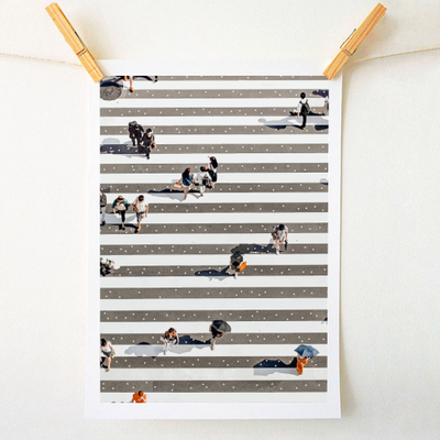
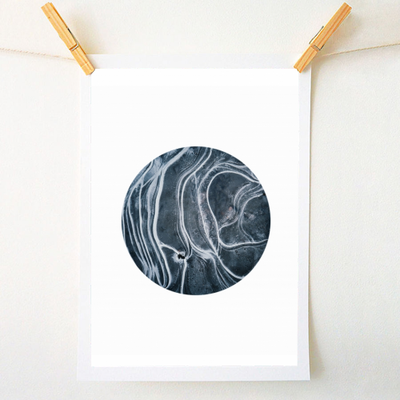
Ultimate Grey is a solid and dependable colour that provides a firm foundation, while encouraging feelings of composure, resilience and steadiness. A staple nude colour, Ultimate Grey can be used in several ways as shown in ‘Rain Crossing’ and ‘Entity’ which are both by Uma Prabhakar Gokhale. The versatility of grey shades mean that they can be used both by themselves in a way which is confident but not intimidating, and with other colours to bring a calming undertone to a piece.
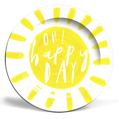
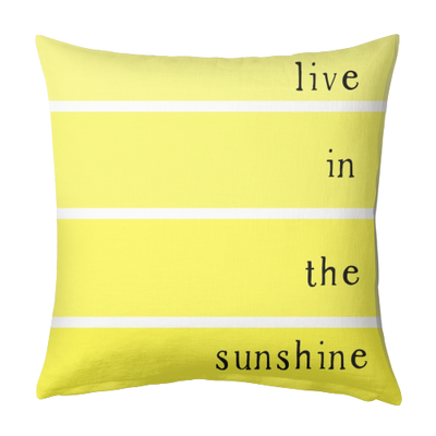
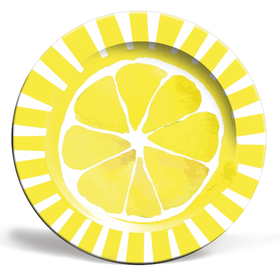
Illuminating, on-the-other-hand, is more uplifting and promises something hopeful and cheerful which bring about energy and liveliness. It is a colour which is playful and childish in the best way! Yellow automatically brings life into any room through its natural brightness and warmth, and this cheerfulness can be seen in many designs which use yellow as their base colour, such as ‘Oh Happy Days!’ by Heidi Clawson, ‘Live in the Sunshine’ by Heidi Clawson, and ‘Citrus Sun’ by Ohkimiko. The brightness of these designs automatically grabs attention and adds warmth to any room, even if it is on something as everyday as a mug or plate!
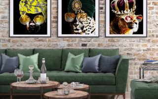
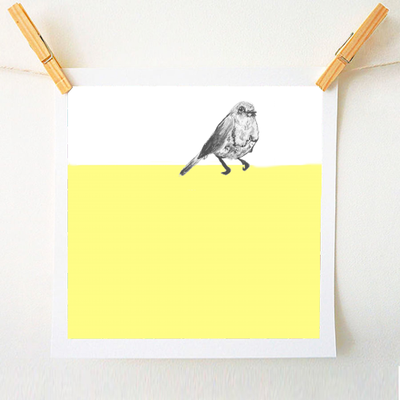
The use of these two colours this year seems very in tune with what is happening at the moment, with the combination reflecting deeper feelings of thoughtfulness with bright accents in order to find a harmonious balance between practicality and playfulness. The colours do not need to be used completely balanced and evenly for the feelings they provoke to work, but instead one colour can take prevalence in order to fit any style and to emphasise a space. Artwork such as ‘Yellow Concrete Fringe’ by Ia Po and ‘Little Sitting Bird’by Chelsiedoesart show exactly how you can use one of the two colours as the main element of a design without it becoming dominating. Even though the colours are not used equally throughout the designs, each is used in juxtaposition to create harmony.
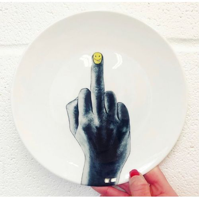
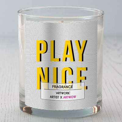
And even though the colour combination of Ultimate Grey and Illuminating reflect a feeling of calming optimism, they can still be used in a playful way to bring life to any room. ‘Middle Finger’ by Nika Akin, and ‘Play Nice’ by The Native State are just two examples of how these colours can still be used in combination to create tongue-and-cheek designs which make perfect gifts to bring a little humour into homeware.
‘Practical and rock solid but at the same time warming and optimistic, this is a colour combination that gives us resilience and hope. We need to feel encouraged and uplifted; this is essential to the human spirit’
– Leatrie Eiseman
Executive Director of the Pantone Colour Institute